携帯電話は、入手しやすく、より信頼性の高い機能を備えていることから、世界中でますます人気が高まっています。今日では、人々はほぼあらゆることにモバイルデバイスを利用しています。
以下は、モバイル デバイスを使用してショッピングするときに WooCommerce のパワーを実感できる方法です。
It is possible to easily link returning visitors or new shoppers from your homepage to the product or category page. The links to homepages are one-step from making it easy for mobile users to access products easily. You should make it easy for mobile shoppers to find and learn more about your products quickly. Here are some tips to help you do that:
The home page to your store is most likely where new visitors go to learn more about your enterprise, what you deal in, and what sets you apart from others. Thus, you may be tempted to staff a lot of information there. However, remember that what looks good on a laptop's screen may lead to endless scrolling on a user's mobile device. To avoid flooding your shopper with a lot of information, limit the homepage to just crucial items. Keep in mind that you can direct homepage visitors anywhere using links. This helps you save space while boosting sales.
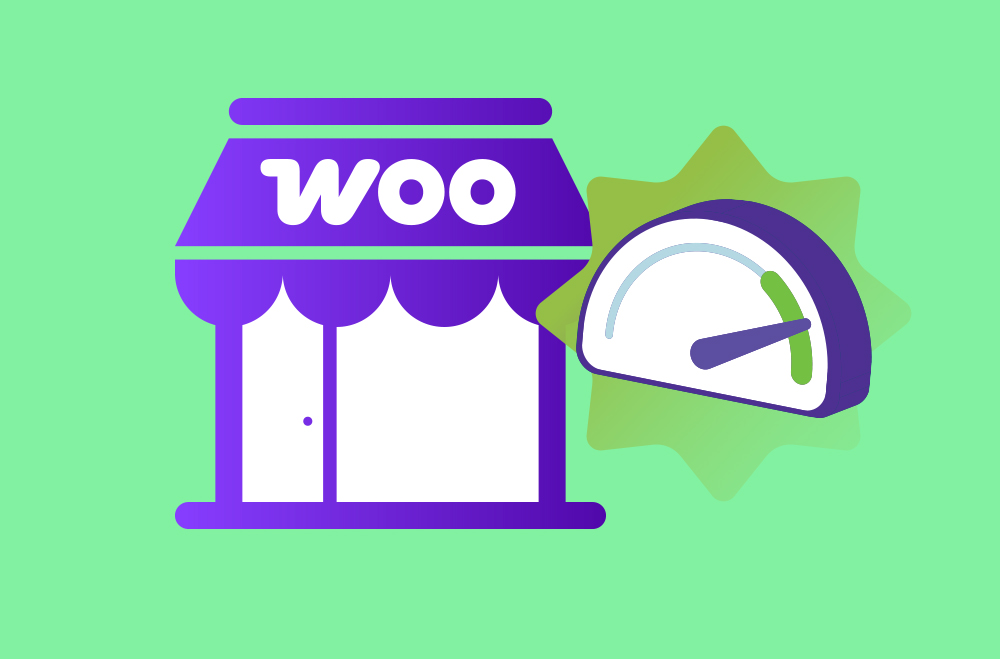
ウェブサイトをモバイルユーザーフレンドリーにする一つの方法は、レスポンシブデザインを採用することです。これは、ユーザーの画面に合わせてコンテンツを自動的に縮小または拡大するウェブサイトのデザインです。モバイルフレンドリーにするもう一つの方法は、WooCommerceを使用することです。WooCommerceには有料の拡張機能や組み込みオプションが用意されており、買い物客の満足度を高め、レイアウトを改善するのに役立ちます。
モバイルデバイスの性能が向上し、多くの顧客がオンラインショッピングにモバイルデバイスを使用しているとしても、レスポンシブテーマだけではサイトへの訪問者数を増やすのに十分ではないかもしれません。幸いなことに、モバイルWooCommerceには多くのオプションが用意されており、ストアの変更方法に制限はありません。顧客のニーズに合ったコンテンツになるようにウェブサイトをデザインするだけで十分です。
Shoppers consider many factors, such as reviews and copywriting, before deciding to purchase. The photos on your website also determine whether a client will buy a product or not. If the mobile shoppers cannot view these images well, they will not purchase the products. Fortunately, mobile WooCommerce gives shoppers an experience that is mobile-friendly. The latest WooCommerce version helps to improve mobile user's experience. The latest gallery displays images in their real size on mobile. What's more, touch gestures are now improved; users can swipe left and right to view the images, swipe up, zoom, and more.
Remember to look at the checkout experience that small screen users have. This can determine whether a shopper abandons a cart or not. Avoid asking for a lot of information or making the process take too long. If you ask your shoppers to fill out information that is unnecessary, consider using this extension to add, change, or remove the fields to make their experience smooth. If the checkout is causing issues on its own, consider cutting it down to one page especially if it is taking many steps. Use this link to learn more about how to optimize your checkout. You should also check if the payment options are slowing your checkout down.
決済手続きは、買い物客にとって簡単なものでなければなりません。プロセスはシンプルであるべきです。しかし、決済代行業者によっては、最後のステップが面倒だったり、せっかちなユーザーにとっては遅すぎたりして、スムーズに決済が進まない場合があります。そのような場合は、以下の拡張機能をお試しください。


After addressing every factor leading up to the cart, the other processes of paying should be hustle-free. The mobile-friendly website should be ready for small screens now. Luckily, there are one-touch or fast mobile payments via various WooCommerce extensions such as:


Do you want to unlock your potential today? お問い合わせ。
"*" indicates required fields
"*" indicates required fields
"*" indicates required fields
You must be ログイン to post a comment.
