Mobile performance issues appear across nearly every WooCommerce store during technical reviews. Store owners often spend considerable time perfecting desktop layouts, yet the mobile experience (where most traffic actually comes from) frequently receives less attention. When mobile users encounter friction, they typically don't wait around to figure things out. They just leave.
The gap between mobile traffic and mobile conversions often represents customers who were ready to buy but left because the experience wasn't built for them. Slow pages, cramped layouts, and difficult checkout flows can all chip away at potential revenue.

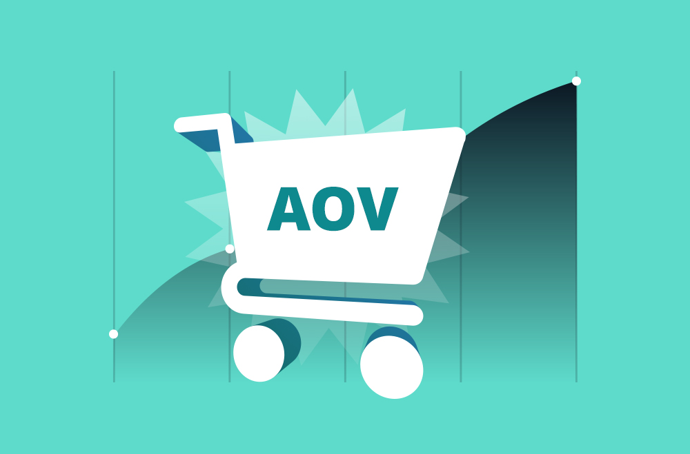
Mobile traffic accounts for the majority of online store visits today, yet mobile conversion rates often lag behind desktop conversion rates. The chart illustrates this performance gap, showing high mobile traffic and cart abandonment rates contrasted with lower mobile conversions. This disconnect highlights why WooCommerce store owners may benefit from prioritizing speed, simplicity, and user-friendly mobile design. Addressing usability issues can help bridge this gap.
Mobile commerce has already overtaken desktop as the primary shopping channel for many WooCommerce stores. But what matters more than the raw numbers is user expectation. Customers compare mobile experiences not with other small businesses, but with the best ecommerce experiences they encounter daily, such as Amazon, well-optimized Shopify stores, and major retailers. If a site feels slower, harder to navigate, or less intuitive than what they're used to, they often won't patiently fight through it.
Mobile users tend to have less tolerance for friction, especially when pages take too long to load, or checkout forms feel tedious on a small screen. Unlike desktop users, who might bookmark or revisit later, mobile shoppers frequently jump straight to another store when they run into problems.
Testing hundreds of WooCommerce sites reveals that most load too slowly on mobile. The problem usually isn't the theme or even the hosting. It's all the extra components that have been added over time, every plugin, tracking script, social media widget, and third-party tool adds weight to pages.
Start by auditing what's actually loading on checkout pages. Opening browser developer tools and watching what happens during checkout load typically reveals scripts for forgotten tools, tracking pixels from old campaigns, and other unnecessary weight.
Here's what typically helps:
Use tools like Google PageSpeed Insights or GTmetrix to benchmark current speed and track improvements. But don't obsess over getting a perfect score. Focus on the actual load time customers experience.
Technical note: When using WP Rocket or similar caching plugins, make sure the mobile cache is enabled separately from the desktop cache. Some stores have desktop caching working perfectly, while mobile users still receive uncached pages because the mobile cache wasn't configured. The setting is often in a separate "Mobile" tab under the caching options, which is easy to overlook during initial setup.
Responsive design is the baseline now. Sites should automatically adjust to any screen size without breaking. But true mobile optimization requires more than simply fitting content onto a smaller display. It requires understanding how people actually browse on their phones.
Most people hold their phones in one hand and navigate with their thumb. Critical actions should be placed in the bottom 40% of the screen where thumbs can easily reach them. Yet checkout buttons frequently appear at the top of forms, or important navigation elements sit in hard-to-reach corners.
The "Add to Cart" and "Proceed to Checkout" buttons need to be large, clearly visible, and positioned so users can tap them without stretching their thumbs or adjusting their grip. iOS Human Interface Guidelines recommend a minimum tap target size of 44x44 pixels, but 48x48 pixels works better for critical checkout buttons.
Desktop navigation with six levels of dropdown menus does not translate well to mobile. Mobile users need to find what they're looking for quickly, without having to expand multiple menu levels.
Consider implementing a search-first approach on mobile or reducing navigation to the most important categories. Many stores show just 4-5 main categories on mobile and rely on search for everything else. This isn't just a design preference. WooCommerce's mobile menu rendering can become heavy when there are deeply nested categories, increasing page weight. Each menu level adds DOM elements and CSS complexity, which compounds on slower mobile processors.
On mobile, customers can't view multiple product images at once as they can on desktop. Make the main product images high-quality and allow easy swiping between images. Keep product descriptions concise but informative. Mobile users will scroll, but they often won't read dense paragraphs.
Implementation detail: WooCommerce's default gallery with PhotoSwipe lightbox can be sluggish on older mobile devices. Consider disabling it for mobile and letting users view images inline, or swap it out for a lighter alternative like GLightbox. To disable PhotoSwipe specifically for mobile, add this filter to your theme's functions.php:
php
add_filter('woocommerce_single_product_photoswipe_enabled', function() {
return !wp_is_mobile();
});
Progressive Web App (PWA) features can also enhance the mobile experience by enabling offline browsing and faster load times. However, implementing these requires more technical expertise and careful testing across different mobile browsers.
The checkout process is where all marketing, product presentation, and user experience either pay off or completely fall apart. Mobile users typically face more friction during checkout than desktop shoppers. Small issues, such as slow-loading fields, hard-to-tap buttons, confusing steps, or extra required information, can be enough to frustrate customers and lead them to abandon their carts entirely.
Don't force people to create an account before checking out.
While building a customer database has value, forcing account creation on mobile is one of the fastest ways to lose sales. Offer the option to save information for faster checkout next time, but make guest checkout the default, prominent option.
Technical note: WooCommerce's default settings enable guest checkout, but it's not always obvious to users. Many stores see better conversion when they move the guest checkout option above the account creation fields rather than below them. This requires customizing the checkout template or using a filter to reorder form fields:
php
add_filter('woocommerce_checkout_fields', function($fields) {
$fields['account']['createaccount']['priority'] = 120;
return $fields;
});Every field that must be filled out on mobile is a potential point of abandonment. Most WooCommerce stores only need about 8 fields for checkout: name, email, phone, shipping address, and payment information. Yet many stores ask for more than necessary.
Audit checkout and remove anything that isn't needed. If phone numbers aren't required to fulfill the order, don't ask for them. If the city and state can be automatically determined from the ZIP code, do so instead of requiring customers to type them.
Common issue: Stores using plugins that add custom fields without realizing that those fields become required by default. Check WooCommerce → Settings → Advanced → Checkout endpoints and review the field settings. Many "required" checkboxes are ticked unnecessarily. The WooCommerce Checkout Field Editor plugin makes auditing easier by showing all fields in one place with their required status clearly visible.
Modern browsers can autofill many form fields if they're set up correctly. This can be faster than manual entry and typically reduces errors on mobile, where typing is more difficult.
Make sure forms use standard HTML5 input types (email, tel, etc.), so mobile devices display the appropriate keyboard for each field. Nothing frustrates users more than having to switch back and forth between text and numeric keyboards.
Technical gotcha: When customizing WooCommerce checkout fields, use `type="tel"` for phone fields, not `type="text"`. Otherwise, users have to manually switch to the numeric keyboard. The same goes for email fields; use `type="email"` so mobile keyboards show the @ symbol by default. Here's the correct implementation:
php
add_filter('woocommerce_checkout_fields', function($fields) {
$fields['billing']['billing_phone']['type'] = 'tel';
$fields['billing']['billing_email']['type'] = 'email';
return $fields;
});Apple Pay, Google Pay, and PayPal offer one-tap checkout options that can speed up mobile purchases. Implementation varies, but these payment methods are becoming more common on WooCommerce stores.
The benefit isn't just speed, it's trust. Many customers, particularly first-time buyers, feel more comfortable using a known payment provider than entering their card details directly on a new site.
Reality check: Express payment buttons need to be visible above the fold on both product and cart pages to be effective. Some stores have Apple Pay enabled, but bury it below three other payment options, which defeats the purpose. Most payment gateway plugins let you reorder payment methods in WooCommerce → Settings → Payments by dragging them into priority order.
Testing mobile experience matters because desktop assumptions rarely reflect how real shoppers behave on their phones. What feels smooth on a large screen can become slow, cramped, or frustrating on mobile, especially when users rely on touch navigation and smaller keyboards.
Evaluating a store on an actual device (not just a browser's responsive mode) helps uncover issues that can affect conversions, such as difficult form fields, slow-loading pages, or buttons placed outside natural thumb reach.
Here are 10 tasks to include in mobile testing routines:
Important distinction: Browser-responsive mode won't provide a true mobile experience because it doesn't account for actual touch behavior, mobile browser quirks, or cellular connection speeds. Testing on actual iPhones and Android devices with throttled connections shows what customers really experience. Chrome DevTools has a network throttling option (set to "Slow 3G") that simulates poor cellular connections. This often reveals performance issues that don't appear on fast WiFi.
Taking action on mobile optimization doesn't require a full redesign. Small, targeted improvements can often deliver measurable results. The key is to focus on the areas that directly affect speed, usability, and checkout flow.
Start with these changes:
Test mobile checkout right now on an actual phone. How long does it take to complete a purchase from finding a product to the confirmation page? Note where frustration occurs, or zooming becomes necessary.
Check mobile page speed using Google PageSpeed Insights. If the mobile score is below 50, there are likely performance issues worth addressing. Don't chase a perfect 100 score. Focus on the actual opportunities the tool identifies; these are typically the changes that will have the most impact on real-world performance.
Look at mobile analytics. What's the mobile conversion rate compared to desktop? If mobile is noticeably lower, that's where the opportunity lies. In Google Analytics, navigate to Reports → Engagement → Conversions, then add a secondary dimension of "Device category" to see the breakdown.
Review checkout form fields. Eliminate anything that's not necessary to complete the order. Some stores reduce the number of form fields from 15 to 8 and see improvements in conversion. Use WooCommerce → Settings → Shipping to review if you're asking for both billing and shipping addresses when a shipping address alone would suffice.
Add at least one express payment option if none exist. The WooCommerce Payments or Stripe plugins make this relatively straightforward. Installation typically takes under 30 minutes, and the impact of the conversion on mobile often justifies the effort within the first month.
Mobile optimization isn't a one-time project. It's an ongoing process. As sites evolve and new features are added, test them on mobile first. The desktop experience can be solid, but if the mobile experience is frustrating, revenue is potentially being left on the table.
The stores that perform well in mobile commerce aren't doing anything magical. They're focused on removing friction from the mobile shopping experience. Every second of load time, every unnecessary form field, every hard-to-tap button can be a potential lost sale.
Customers are already shopping on mobile. The question is whether they're buying from stores with optimized experiences or from competitors whose mobile experience doesn't get in their way.
The right plugins can help improve how WooCommerce stores perform on mobile by addressing speed, streamlining checkout, reducing friction, and improving overall usability. These tools can help fix common bottlenecks such as slow load times, heavy scripts, poor navigation, and complicated forms.

WP Rocket is a performance plugin that can improve mobile speed without requiring deep technical knowledge. It handles caching, file optimization, lazy loading, and database cleanup to reduce page load times.
Features:

Imagify helps fix one of the most common mobile issues: oversized images. Large product photos and banners can slow down mobile pages. Imagify automatically compresses images on upload and can convert them into next-gen formats like WebP.
Features:

When paired with a LiteSpeed server, LiteSpeed Cache optimizes WooCommerce. It offers server-level caching, image optimization, and CSS/JS compression that can boost mobile performance. This plugin works well for stores with heavy product inventories and high traffic.
Features:

NitroPack is an automated optimization platform designed for site owners who want faster mobile performance without having to configure complex settings. It handles caching, CDN delivery, image compression, and code optimization automatically.
Features:

Stripe provides a clean mobile checkout experience, especially with support for Apple Pay, Google Pay, and Link. By enabling one-tap express checkout, stores can reduce the number of steps mobile customers must take to complete a purchase.
Features:
After working with hundreds of WooCommerce stores, the same mobile issues keep coming up. Most stores don't need a complete redesign. They need to address specific friction points that prevent mobile customers from completing purchases.
The stores that convert well on mobile share a few common traits: load times under 3 seconds, clean checkouts with minimal required fields, express payment options prominently placed, and, most importantly, regular testing on actual mobile devices rather than assuming that desktop optimization translates to mobile.
Start with speed, simplify checkout, and test everything on actual mobile devices. Focus on removing friction rather than adding features, and track mobile conversion rate over time to see what's working. Missing features don't usually cause the mobile performance gap; it's driven by excessive friction in the buying process.
The common mistake stores make is assuming mobile optimization requires a complete redesign. Usually it doesn't. Most stores can improve their mobile conversion rates by addressing a handful of specific issues: slow image loading, too many form fields, hard-to-tap buttons, or missing express payment options. Identify the friction points causing the most abandonment first, fix those, then move to the next issue.

"*" indicates required fields
"*" indicates required fields
"*" indicates required fields