If you run an online store, you have probably invested time in page speed, SEO, product pages, checkout flow, and conversion optimization. But one area often gets pushed aside: web accessibility. For small ecommerce businesses, gaps here can quietly affect sales, trust, usability, and long-term credibility.
Accessibility is not just about meeting legal requirements or checking a compliance box. It is about making sure more people can browse your products, understand your content, complete a purchase, and interact with your store without unnecessary barriers. That includes customers who use screen readers, navigate by keyboard, use mobile devices, have slower connections, or have different visual and cognitive needs.
When accessibility is done well, it often improves the overall shopping experience. Clear headings, readable text, proper image descriptions, simple navigation, and well-structured pages can also support SEO and usability. This guide walks through practical steps small ecommerce store owners can take to create a more inclusive, user-friendly, and better-performing website.
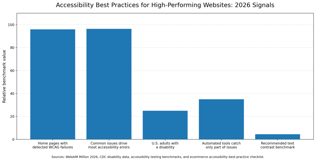
According to the WebAIM Million report, 95.9% of home pages had detectable WCAG failures, with a small number of issue types accounting for most problems. According to the CDC, more than 1 in 4 U.S. adults has a disability, a substantial share of any potential customer base. Automated tools are a useful starting point, but they typically catch only some accessibility issues, so manual testing, keyboard checks, screen reader reviews, proper contrast, alt text, labels, and semantic structure are still necessary for a thorough review.
Web accessibility is the practice of designing and developing your site so that everyone, including people with visual, auditory, motor, or cognitive disabilities, can perceive, understand, navigate, and interact with your content effectively.
The governing standard is the Web Content Accessibility Guidelines (WCAG), published by the W3C. Most accessibility requirements for US businesses reference WCAG 2.1 at Level AA as the target. The guidelines are organized around four core principles, often called POUR:
These principles translate directly into things like image alt text, keyboard navigation, readable color contrast, and clean heading structure, all of which also tend to improve usability for everyone.
According to the CDC, roughly one in four US adults lives with some type of disability. That is a significant portion of potential customers who may struggle to browse a product catalog, complete a checkout form, or finish a purchase if a store has accessibility gaps.
Beyond the customer base, legal considerations matter. According to annual tracking by UsableNet, ADA-related web accessibility lawsuits have increased steadily in recent years. While large retailers are most frequently targeted, small ecommerce businesses are not immune. Documenting a good-faith effort toward accessibility can help demonstrate a reasonable intent to comply.
There is also a performance angle worth noting. Many accessibility improvements, such as semantic HTML, optimized images, and clear content structure, overlap with what search engines evaluate for Core Web Vitals and SEO. Building accessibility often means building more efficiently.
Most accessibility problems on ecommerce stores fall into a handful of recurring categories: poor color contrast, missing alt text, unclear form labels, keyboard navigation issues, and confusing checkout flows. Addressing these areas often creates the most meaningful impact because they affect usability, reduce friction, and support stronger alignment with accessibility standards.
Every product image should have an alt attribute that describes what the image shows. Screen readers rely on this to communicate product details to visually impaired shoppers. Decorative images, such as dividers or background graphics, should have empty alt attributes alt="" so screen readers skip them.
Descriptive alt text can also support SEO. Keyword-relevant descriptions may help product images appear in Google Image Search, which is a traffic source many stores overlook.
WCAG 2.1 requires a contrast ratio of at least 4.5:1 for normal text and 3:1 for large text against its background. Low-contrast text, such as light gray on white, creates problems not just for users with low vision, but for anyone reading on a bright screen outdoors or on a lower-quality display.
Free tools like WebAIM’s Contrast Checker make it straightforward to test color combinations before publishing.
Some users cannot use a mouse. They navigate websites using a keyboard, including Tab, Enter, arrow keys, and other assistive input devices. If your site’s menus, modals, or checkout steps cannot be fully navigated by keyboard, those shoppers reach a dead end.
A practical test: unplug your mouse and try to browse your store, add a product to your cart, and complete checkout using only the keyboard. Navigation gaps tend to surface quickly.
Every form field, including name, email, address, and credit card fields, needs a properly associated <label> element. Placeholder text alone does not meet this requirement. Screen readers use label associations to identify what each field is for. Without them, checkout becomes difficult for users relying on assistive technology to navigate.
Headings are not just for visual hierarchy. Screen reader users often navigate pages by jumping between headings, similar to scanning a table of contents. If product pages use heading tags out of order, skip from H1 to H4, or use heading tags purely for styling, the logical structure breaks down.
A clean approach is to use one H1 per page, typically the product or page title, followed by H2 and H3 headings in logical sequence. This also reinforces on-page SEO signals.
If you use video for product demos, tutorials, or brand content, WCAG guidelines require captions for prerecorded audio content. Auto-generated captions from platforms like YouTube have generally improved, but they still often contain errors, especially with product names, technical terms, or brand-specific language. Reviewing and correcting them before publishing is worth the time.
One useful insight from modern web development is that accessibility and performance improvements often overlap. Semantic HTML using proper tags like <nav>, <main>, <article>, and <button> instead of generic <div> elements is lighter, faster to parse, and easier for both screen readers and search engine crawlers to interpret.
Optimizing images for faster load times can also benefit low-vision users who rely on assistive technology that processes images sequentially. Clear, logical content structure tends to reduce cognitive load for users with attention or processing differences and often improves time-on-site metrics for general visitors.
A progressive enhancement approach, building a usable, accessible baseline before layering on animations, scripts, and advanced functionality, means your store continues working even when JavaScript loads slowly or fails. That resilience also benefits accessibility and overall site reliability.
If you are not sure where to start, work through this list first; it covers the highest-impact accessibility items for a typical WooCommerce or ecommerce store. Addressing these areas can help improve the shopping experience while supporting stronger accessibility compliance.
<label> elements.<title> tags are unique and descriptive on every page.Several free and low-cost tools can quickly identify common issues, such as missing alt text, poor color contrast, heading problems, form label errors, and keyboard navigation barriers. These tools provide a practical starting point before moving into deeper manual testing.
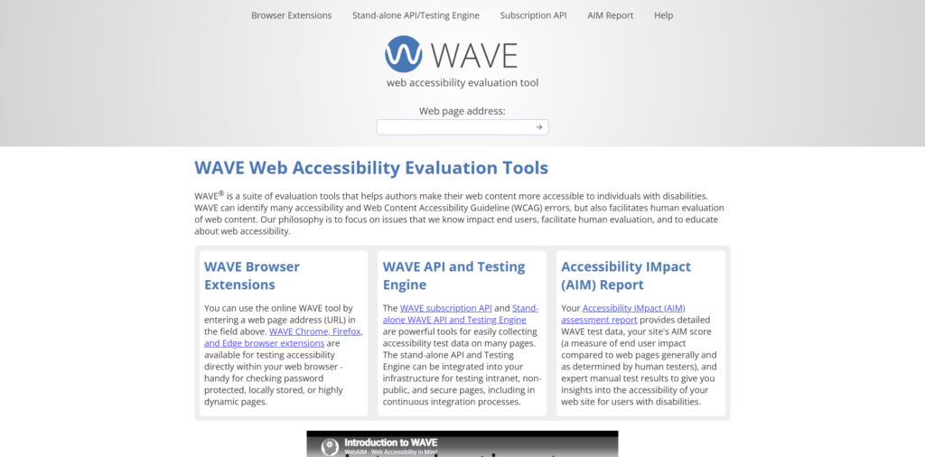
WAVE is a browser extension that visually identifies accessibility issues directly on a webpage. It is a good starting point for reviewing page structure, missing alt text, contrast issues, form labels, and other common accessibility concerns.
Features:
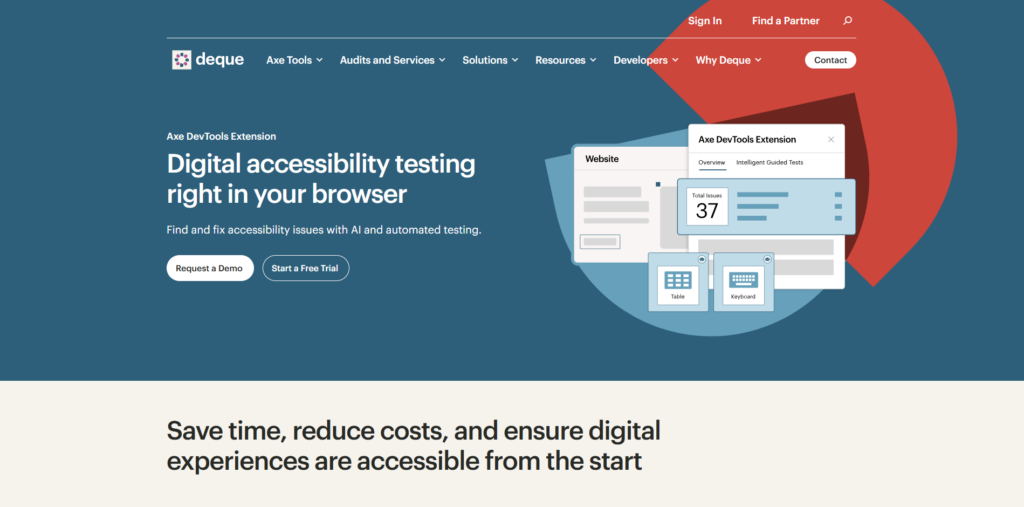
axe DevTools is a browser-based accessibility testing tool from Deque. It helps developers and site owners identify accessibility defects with automated checks and guidance for fixing issues.
Features:
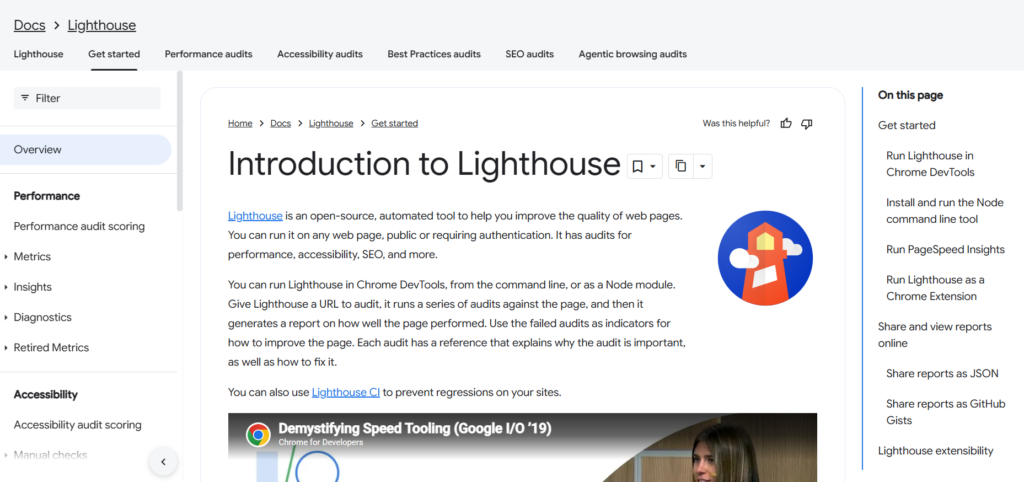
Google Lighthouse is built into Chrome DevTools and audits webpages for accessibility, performance, SEO, and best practices. It generates a report with failed audits and recommendations for improvement.
Features:
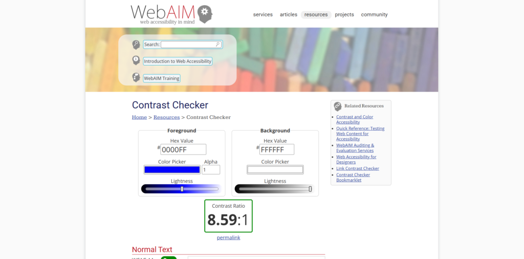
WebAIM Contrast Checker is a simple tool for testing foreground and background color combinations. It helps confirm whether text contrast meets accessibility requirements for readability.
Features:
Screen reader testing helps you experience a website the way many blind and low-vision users navigate it. NVDA is a free screen reader for Windows, while VoiceOver is built into Apple devices.
Features:
Automated tools are a useful starting point, but manual review, particularly keyboard navigation and screen reader testing, is still necessary for a thorough assessment.
“Accessibility is only for people with severe disabilities.” Accessibility improvements can benefit a wider range of users than many store owners expect: older shoppers, mobile users on slow connections, people with temporary injuries, and users in bright sunlight who need higher contrast. The population that benefits from accessible design is often larger than the population with formally diagnosed disabilities.
“Making my site accessible will slow it down or hurt my design.” In most cases, the opposite is true. Semantic HTML is lighter than div-heavy markup. Proper image alt text adds no meaningful page weight. High-contrast, readable typography is generally considered a stronger usability practice. Accessibility and visual quality are typically compatible goals.
“My site passed an automated scan, so it’s accessible.” Automated scans are a useful first step, but they cannot evaluate everything: screen reader experience, logical reading order, whether error messages make sense in context, or whether keyboard navigation works end to end. A clean scan is a floor, not a finish line.
A practical starting sequence for a small ecommerce store is to begin with the most visible and conversion-critical areas: navigation, product pages, forms, and checkout, then address sitewide issues such as color contrast, image alt text, headings, and mobile accessibility.
Accessibility is an ongoing process. The goal is consistent improvement over time, not one-time perfection.
Web accessibility means designing and managing your ecommerce website so more people can browse products, read content, use forms, and complete purchases without barriers. This includes users with visual, auditory, motor, or cognitive disabilities, as well as shoppers using screen readers, keyboards, mobile devices, or slower connections.
Accessibility matters because it can improve usability, customer trust, and the shopping experience. It may also support SEO, reduce checkout friction, and help small businesses demonstrate a good-faith effort toward accessibility compliance.
Common issues include missing image alt text, poor color contrast, forms without proper labels, confusing heading structure, keyboard navigation problems, inaccessible popups, and videos without captions.
Many accessibility best practices also align with SEO fundamentals, including descriptive alt text, semantic HTML, clear headings, readable content, optimized images, and structured navigation. These improvements can help both users and search engines better understand the site.
No. Accessibility plugins can help identify issues or add useful visitor tools, but they do not replace proper development, manual testing, WCAG-focused audits, or ongoing accessibility improvements.
Start with the highest-impact areas: homepage, product pages, navigation, forms, and checkout. Run an accessibility audit, add missing alt text, improve color contrast, check form labels, and test the full checkout process using only a keyboard.
Review accessibility regularly, especially after theme changes, plugin updates, redesigns, new product uploads, or checkout changes. It works best as an ongoing workflow rather than a one-time project.
Helpful tools include WAVE, axe DevTools, Google Lighthouse, WebAIM Contrast Checker, NVDA, and VoiceOver. Automated tools help find common issues, but manual keyboard and screen reader testing is still needed for a more complete review.
If an audit reveals significant issues or you are working through a site redesign, involving someone with hands-on accessibility experience can help move things forward more efficiently, whether that is a developer who builds to WCAG standards or a dedicated audit from an accessibility firm. Many fixes are straightforward once someone with the right background reviews the site.
For ongoing management, particularly on WooCommerce stores with frequently updated product catalogs, building accessibility checks into your content workflow the same way you might review meta descriptions or product photos before publishing tends to be more effective than periodic one-time audits. If you have questions about where your store currently stands or how to build accessibility into your ongoing process, that's worth discussing with your development team or agency.
"*" indicates required fields
"*" indicates required fields
"*" indicates required fields